Data Visualization in Content Marketing and Turning Insights into Actionable Strategies
The Importance of Data in Modern Content Marketing In the era of digital marketing, data is everywhere—from website visits and bounce rates to social shares and conversion metrics. But raw numbers alone don't tell the whole story. To make informed decisions, marketers must transform this data into meaningful insights. That’s where data visualization becomes critical. It helps content teams quickly interpret performance, identify opportunities, and pivot strategies based on real evidence.
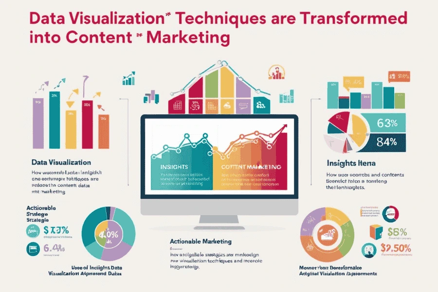
What Is Data Visualization and Why It Matters
Data visualization is the graphical representation of information using charts, graphs, maps, and dashboards. It turns complex data sets into easily digestible visuals. This is especially important in content marketing, where marketers must constantly monitor performance across multiple channels. Visualizing this data improves understanding, accelerates decision-making, and enhances communication across departments.
- Different types of visualizations are suitable for different purposes:
- Line graphs help track content performance trends over time.
- Bar charts compare engagement across blog posts, videos, or social channels.
- Pie charts show distribution of traffic sources or audience segments.
- Heatmaps reveal where users click or scroll on a web page.
- Funnel charts highlight drop-off points in conversion journeys.
Turning Insights into Actionable Strategies
The real power of data visualization lies in using the insights to take action. For instance, if a heatmap shows users rarely scroll past the halfway point of an article, it may prompt you to restructure your content or move CTAs higher. If traffic visualizations show spikes from a certain keyword, you can double down on related SEO efforts. Visualization helps marketers quickly spot what’s working and what’s not—enabling faster, smarter adjustments.
Tools for Visualizing Content Performance
- Google Looker Studio (formerly Data Studio): Integrates with Google Analytics, Ads, and more to build custom dashboards.
- Tableau & Power BI: Ideal for deeper analysis and storytelling through complex datasets.
- SEMrush & Ahrefs: Offer SEO and content performance visualizations.
Visual Reporting for Stakeholders and Teams
Visual reports streamline communication between marketing teams, leadership, and clients. Instead of overwhelming them with spreadsheets, visuals quickly highlight key takeaways like ROI, campaign impact, and areas of improvement. By pairing visuals with short, strategic summaries, teams ensure everyone is aligned and decisions are data-backed.
Optimizing Content with Data Visualization
- Topic Selection: Identify which themes generate the most traffic and engagement.
- Format Optimization: See whether blogs, videos, or infographics perform best on certain platforms.
- Publishing Schedule: Determine the best times and days to post based on audience behavior.
- Audience Segmentation: Understand which demographics respond to which types of content.
Conclusion
Data visualization is more than just a reporting tool—it’s a strategic asset for content marketers. By turning raw data into clear, visual insights, marketers can better understand their audiences, make faster decisions, and drive more impactful content strategies. When paired with the right tools and a mindset for action, visualization becomes the bridge between content performance and marketing success.
Active Events
Navigating the World of SERP Features: Tips, Tricks, and Strategies
Date: Aug 07, 2025 | 7:00 PM(IST)
7:00 PM(IST) - 8:10 PM(IST)
2811 people have registered
Best Tips to Create a Job-Ready Data Science Portfolio
Date: Aug 06, 2025 | 7:00 PM(IST)
7:00 PM(IST) - 8:10 PM(IST)
2811 people have registered
Bootcamps
Digital Marketing Bootcamp
- Duration:4 Months
- Start Date:Aug 09, 2025
Data Science Bootcamp
- Duration:4 Months
- Start Date:Aug 09, 2025